The Latest News

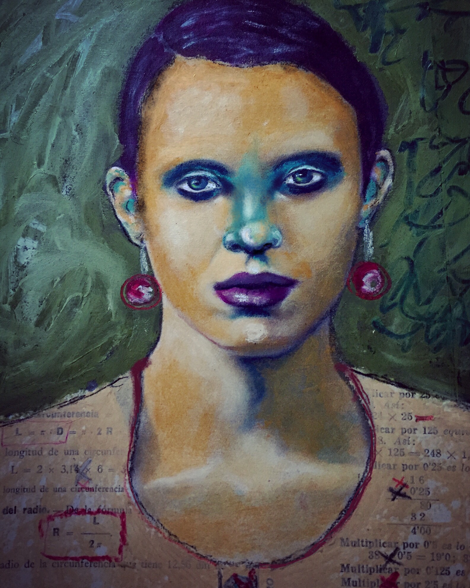
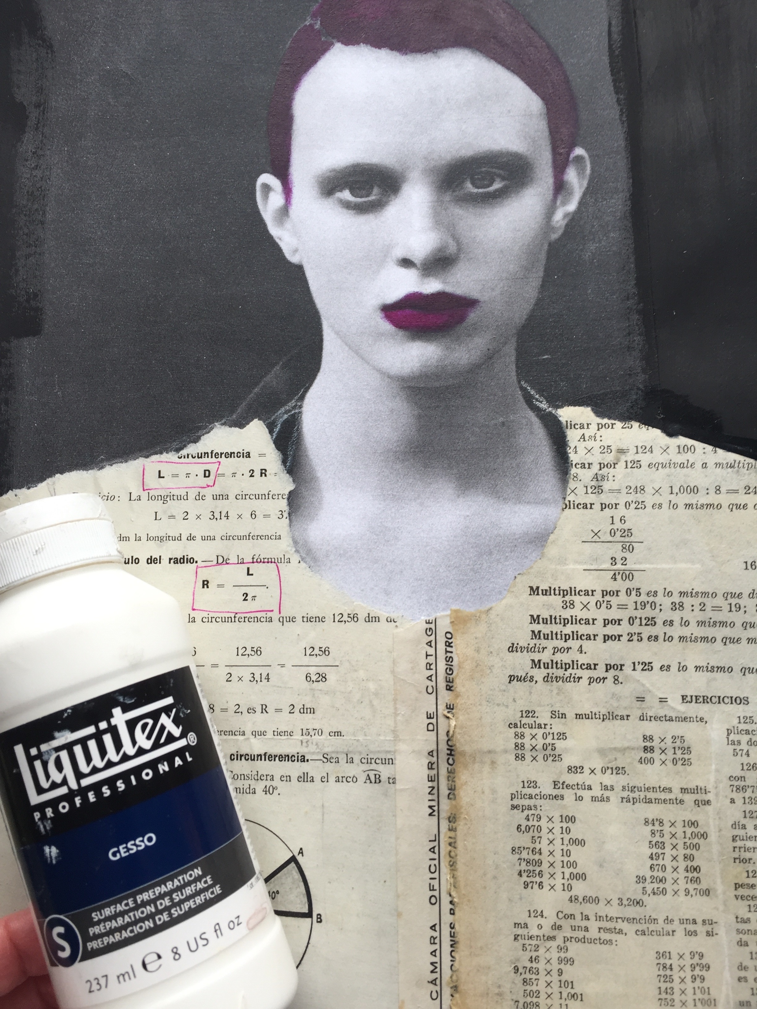
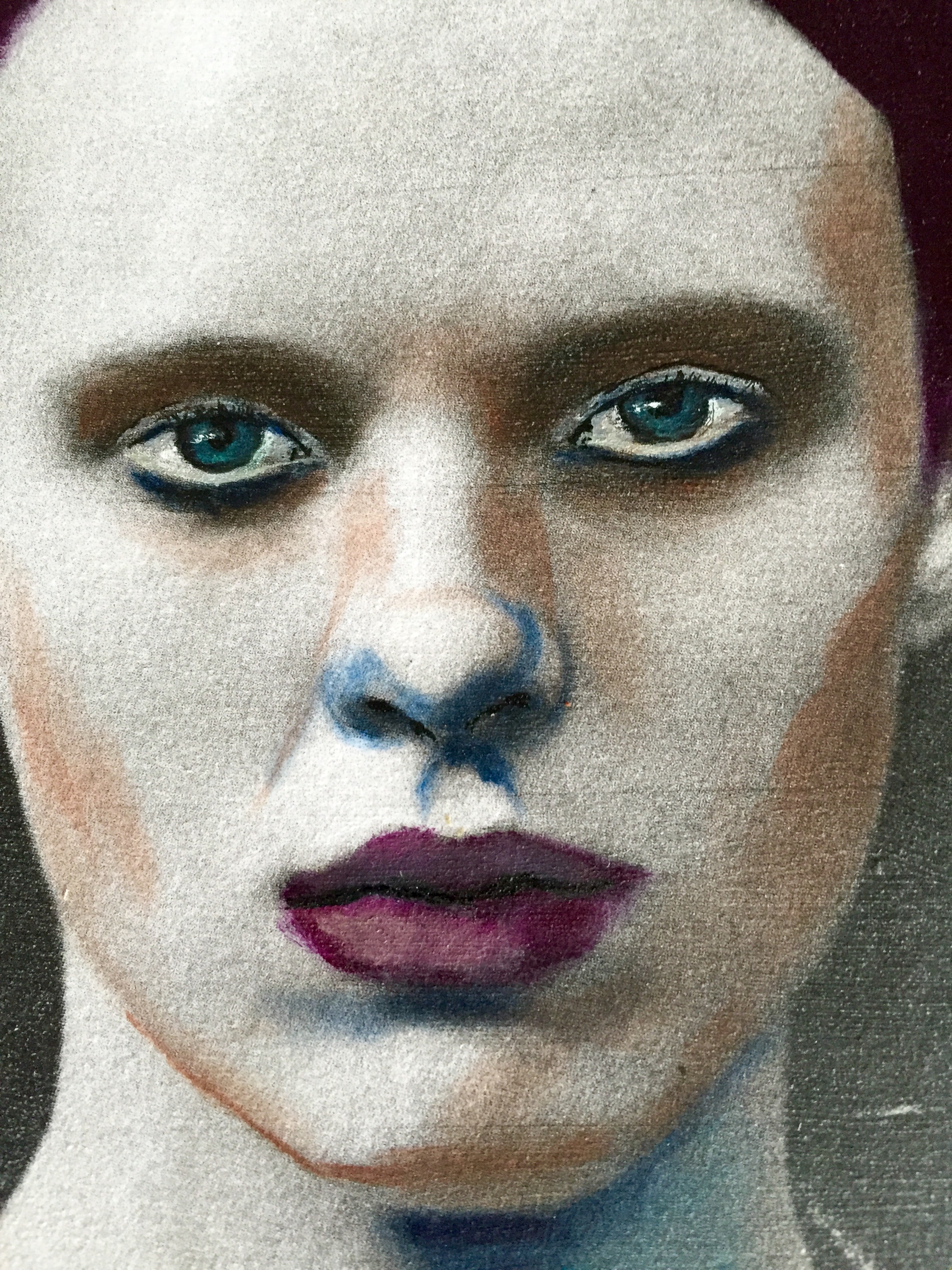
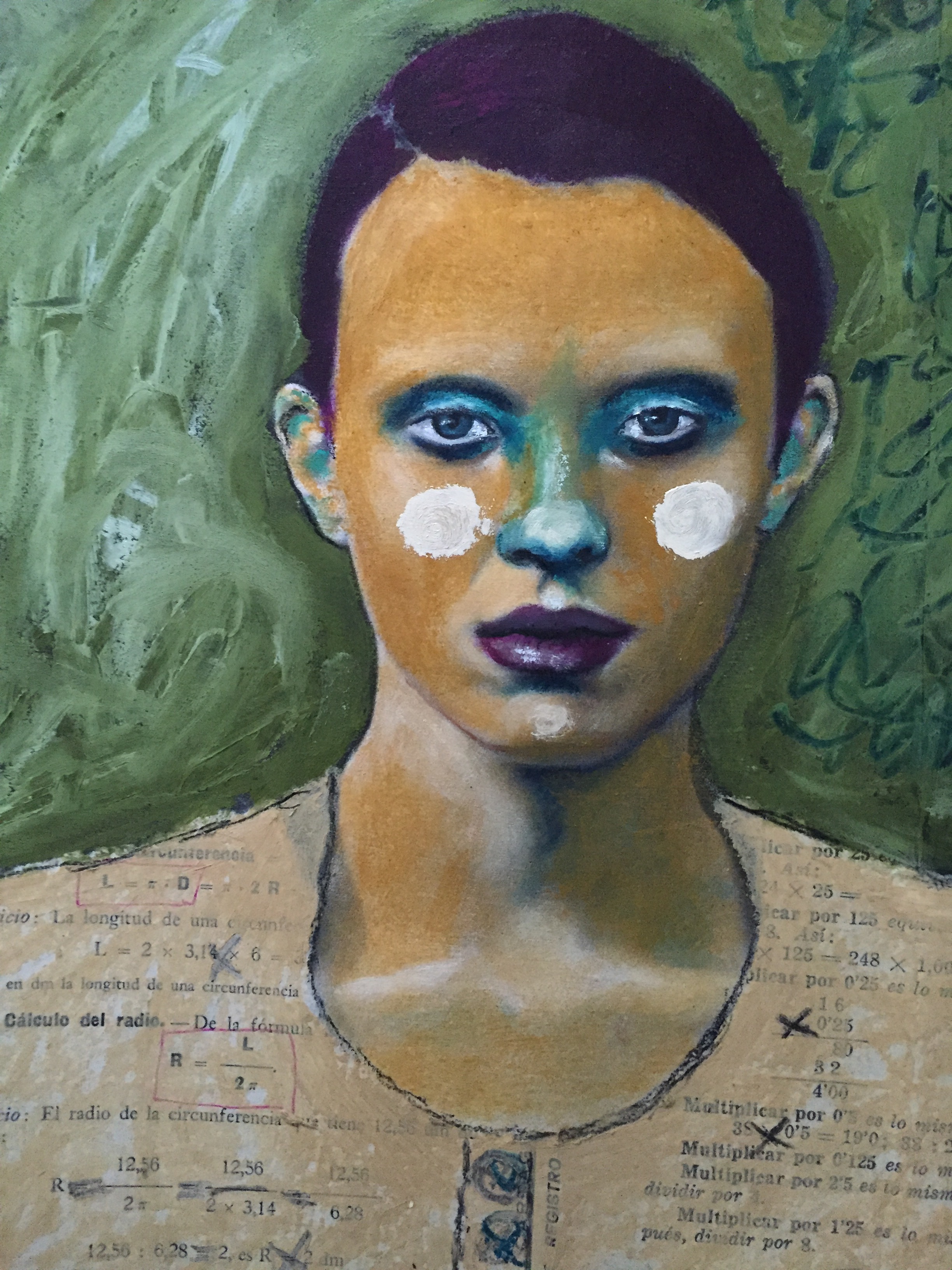
I have a lot of news to share with you.  All good :)  First off I have been completely immersed and in the flow of my daily art practice.  As is always the case with me  it is an "experience" fraught with comedy and drama each and every day. From sun up to sun down I can be found surrounded by paints, brushes and art in the making at any one of the various portable studios I have set up all over the house.  My husband used the word "relentless" in regards to my practice as he was walking by one of the multitude of times he had witnessed me with my head bent down, oblivious to all else but the girl I was coaxing into life. I told him later that was a huge compliment. 


We celebrated my sweet Ivy's birthday by going out for sushi.  She made a wish before blowing out the candle that was nestled within her green tea sundae, 'aka' birthday cake but refused to reveal her wish to me so I have no news for you on that subject. We ended our perfect afternoon at Anthropologie  selecting new coffee cups and fragrant candles to use in our studios. 


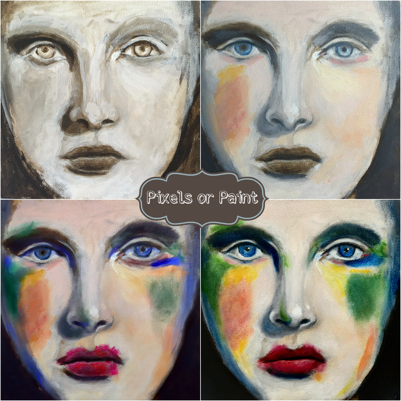
The week prior was highlighted by a visit from our friend Janet Reid. We picked her up from the airport on a Wednesday and for the next three days proceeded to laugh, eat good food and learn to paint the tiny tea bag faces taught in Jeanne-Marie Webb's,  class Tiny Bags of Love. The class is divine and the gentle teachings of Jeanne -Marie helped me not only paint the adorable faces  of Astrid and Tilli that you see there on your left but also helped me grasp some larger concepts about painting loose and impressionistic faces of any size.

Working through the class during the visit with Janet added richness to both experiences. I am also lucky enough to be making the sojourn to Janet's home and studio in Southern California next month and I'm sure I will have lots to share with you afterward.


The last thing I have to share today is how I happy I am to be a returning teacher in the upcoming all new Let's Face It 2017  class hosted by the amazing Kara Bullock. You can find out more and read all about the new content and amazing teacher lineup by clicking any one of the links in this section of the post  or you can read about it here in the teaching section of my site.  And you will be happy to know that I will be doing a  GIVEAWAY of one free spot in this class on my blog in the coming weeks so be sure to subscribe below to my site in order to stay up to date with what is happening! 

Love, Robin

A Little Before and After Painting

More Oil  Pastels


Magazine pages are pretty amazing to work with. Not only because there are no rules and therefore fun to do but also because I learn so much about the art of drawing and painting each time I do one.  Below you see the before and the after of a recent makeover. I photocopied and enlarged the image 160% then used matte medium to glue her into my large sketchbook. She was already a B&W image from W Magazine Then I used clear gesso over the entire thing, adding black gesso  to all the intimidating white that remained.

IMG_9056.JPG

I had already made up my mind I wanted to add collage since all she was wearing was a suit coat that  did nothing for me in terms of imagining a clothing makeover using that. I didn't overthink it. I pulled out the first thing from a pile of collage material and ended up with an Italian math workbook. So she became a mathematician in my mind.  And Italian.  And cool. My color choices were based on the magazine image below done by my initial inspiration artist  Guim Tio'. This complimentary yellow purple isn't generally appealing to me but  I really liked his result so I quickly decided  to just go with it. So now I have violet hair and violet lips. Really? That meant I was willing to use yellow ochre for her skin. I was not too sure about this but I did it anyway. I am keeping the idea of experimentation in the forefront of my mind. I told myself it didn't matter 


So I used the matte medium to change her clothing and put a coat of clear gesso over that. I used acrylic paint for her hair because no way dod I have that color in the oil pastels. So once that commitment was made I moved on without stressing too much. Upon further reflection after the fact I think what I especially had liked about what he had done was the solid abstracted shape of her face and nose.  And i think I wasn't able to let myself go that far. Next time....


I took the opportunity to really focus on the lights and darks as shapes and added umber and dark blue to the areas I could map on her face. The is a fairly high contrast image since it was editorial  high fashion image not a makeup ad. I added all of the colors with a very light handed touch wanting to work in layers and build up a variation of tones. So all of her face is yellow ochre in the middle photo above, just applied in varying layers. I also chose to focus on her eyes since in my mind that was the focal point of the image. The intensity of her look. So her eyes are a combination of oil pastel and charcoal. I thinned the oils pastel and used a fine brush  more or less like traditional oil paint. The background is super thick with three shades of green applied in patches then smooshed around, (not too much) with my fingers. Most of the painting was done with straight pastel, no thinner and with my fingers as the blender. 

I think the red earrings and red marks  in her shirt are key elements to bringing some life and energy to the painting. Otherwise she seemed very subdued and even serious in spite of her having a green nose. Her name is Liliana.


And here she is in her final complimentary color glory! Another lesson learned is that it's just not my palette.

Love, Robin

**If you are interested in learning more about using oil pastels and magazine pages go to my class page and read more

"What materials did you use for that painting?"

That question has certainly popped into my mind when a particular artwork captures my interest and curiosity. When I am inspired to learn more and try things out for myself I make the effort to deconstruct what I see. Its good archeological practice  in my ongoing effort to better learn the art of observing.  Ive come to understand that being able to look and really see is one of the secrets to creating great art. But I digress.  The question I most often hear in regards to my own art is  "iPad or Paper?" 

I love giving the answer to this question because it is often an intriguing surprise one way or another to the person asking. I am what you might call an enthusiastic promoter for the using of the iPad as a tool for practice and exploration in your artistic practice. That is not to say everyone should have an iPad. Having one is a luxury that I am fortunate enough to be able to afford. 

Take the painting above as an example. This began as an original 6x6 oil painting of Teresita.  She remained  a rather bland raw umber work in progress for many months. She was mostly just hanging around looking over my shoulder implying I ought to get on with it and release her from her liminal state. insert eye roll from me. At this stage, using my reference image,  Ivy helped me to practice those essential observational skills I mentioned earlier for the nose shadow. 

 In typical fashion I went on to dab at the thing with the tiniest amount of color to see what would happen.  Literally months passed until I finally took her into my iPad to see what would happen if I actually committed her to real paint. I can be so timid with the paint sometimes. But... and here is the drum roll... by taking her into the iPad I could go crazy with color, do and undo and see all the variations I wanted to try while the original Teresita sat perfectly still next to me. At moments she looked horrified while at others she looked excited at her potential makeover :)  I loved my final choice of rich primary colors! Teresita did not feel the same but I took artistic license and overruled her objections to smeared lipstick! 

The final image is the finished version of what I did with real oil paint on her face using my iPad reference.  It really was stress free by then which I really appreciated. She is currently drying and will be auctioned off  along with several other of my originals in the Holiday Auction that is being sponsored by Stephanie Gagos

Wow there is just so much to learn as an artist! I have appreciated all the ways in which I can assist myself with building my drawing, color mixing and compositional skills by using my ipad!

Love, Robin


Failsafe Color Theory

Failure Friday - This Color Theory Never Fails

"If you're feeling blue  ~  try painting yourself a different color."  Hannah Cheatem age 8

I think the above quote by Hannah Cheatem is perfect for understanding the progression of this pastel portrait. Especially when applied in its most  literal form.  This portrait started during a typical day in my studio with Ivy. We were exploring the use of toned paper and soft pastels. I was at my easel using a monochromatic color palette of blue and white telling myself I needed to focus on my portrait drawing skills. Ivy was working on her own portrait. 

When I finally turned to look at her and  her progress I was a bit stunned and said  "Oh my goodness!" She clearly had not stayed within safety zone of a monochromatic palette. Instead he had chosen to explore a richly saturated palette of color ranging from the blue/green undertones of the skin to the multiple shades of green/gold of the eyes. There were interesting marks of reds, and salmons and oranges placed throughout the piece causing your eye to roam yet return to the beautiful face.

 That day in the studio was just one of the many wake-up prompts I receive from being part of a vast community of artists. My initial response to Ivy was to laugh out loud both from the delight of seeing what she had done but also because of the excitement I felt when seeing the obvious potential of what is possible if I move past my tentative approach and let go of my fears. The Failure Friday lesson is for me to remember it is just paper, that there are no mistakes, just exploration and experimentation.  Challenging my cautious artist self to be more bold, daring and exploratory will be more effective for bringing on growth than getting lost in the shape of a perfect nose!

Later that night I continued with my very blue portrait and placed the brightest orange I could find around the head and to the cheeks. I asked myself about the gender and knew I had inadvertently created a male as a direct result of being overly exacting in my approach to the proportions of the head in the initial sketch. So I became intentional by adding hair and softening some of the features ultimately changing him from Mr. Jack Leopold to Jacqueline Leona Padroni :)

Love, Robin